
We build brands as layered systems.
From naming and identity to language and rollout. Each project starts with strategy and story, then expands across the fragments where brands really live.
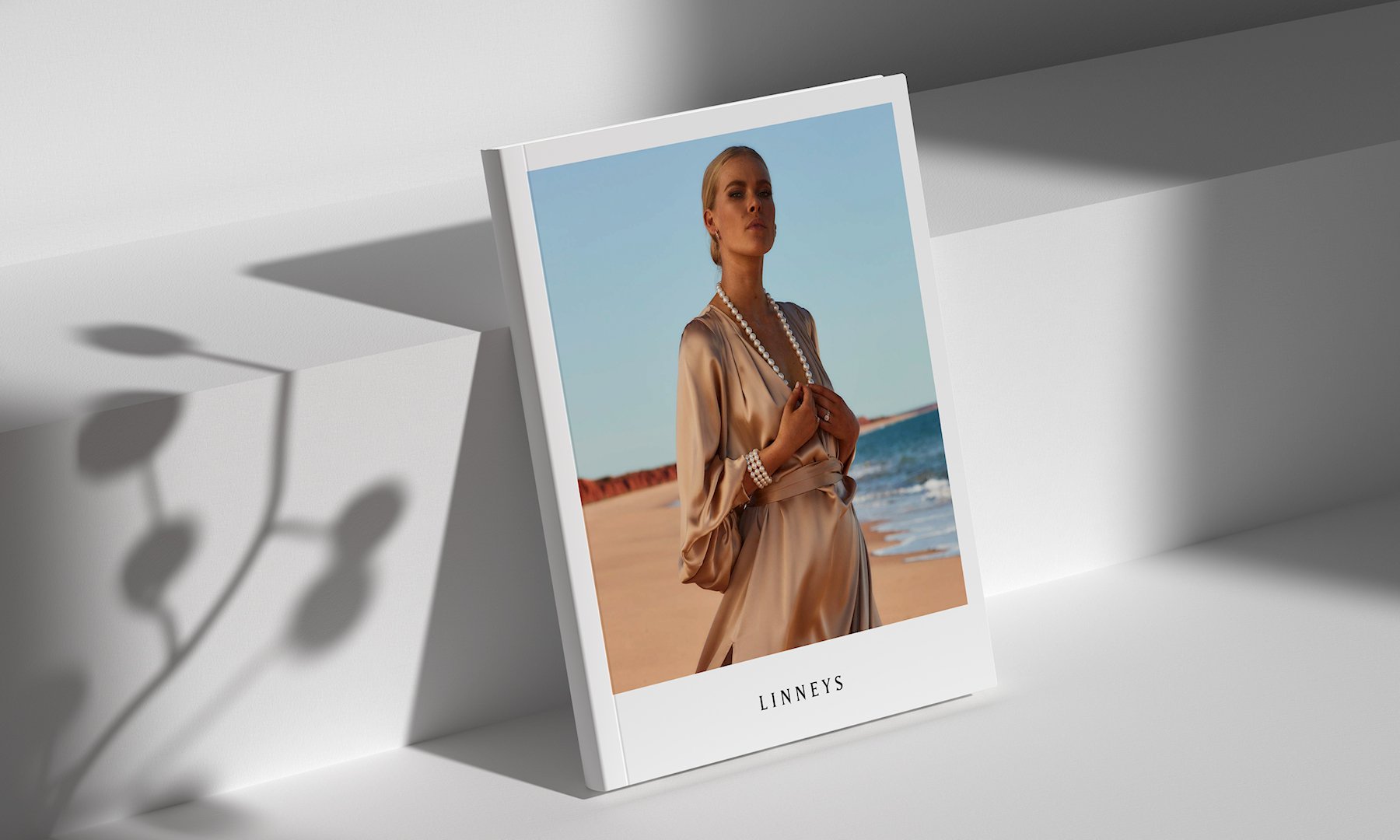
Editorial Design / Art-direction / Print Production
Linneys – The Manari Collection Catalogue
A bespoke print piece created to elevate Linneys’ hero collection, blending story, stillness, and precision across every page.
Branding Refinement / Brand Guidelines / Campaign
Henri Living – Brand Identity Refinement
A refreshed brand identity for a modern furniture retailer, blending minimal elegance with everyday warmth to support a more confident, design-led presence.

Visual Identity / Language Development / Integrated Campaign
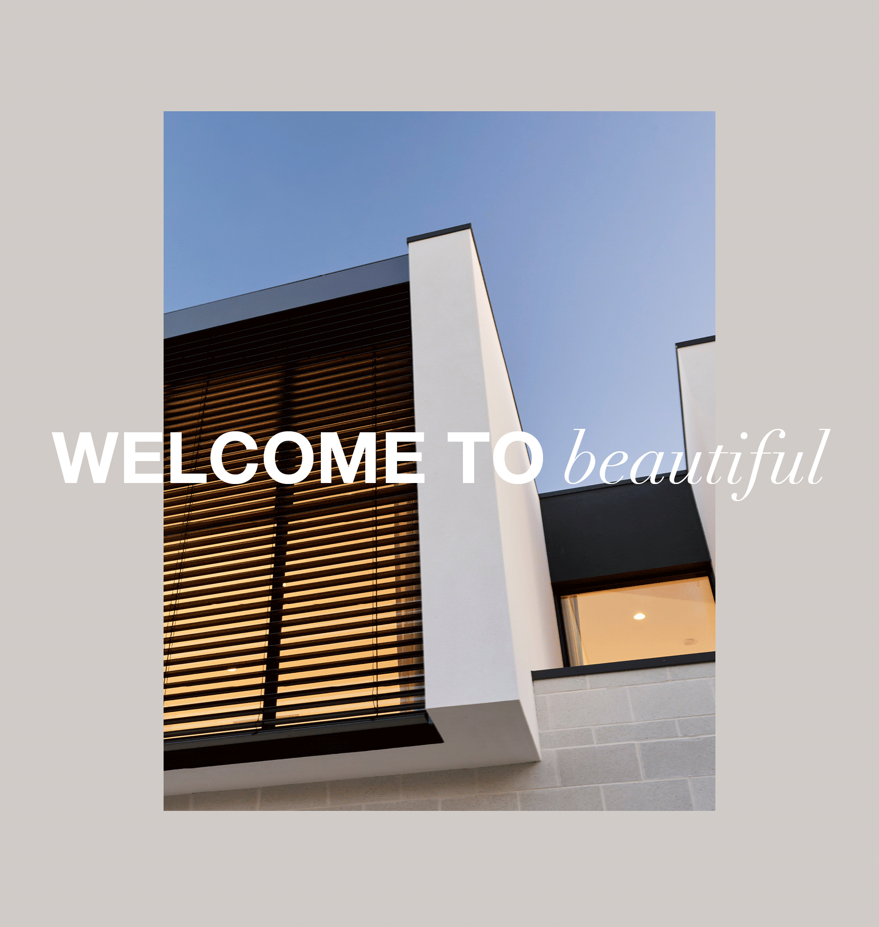
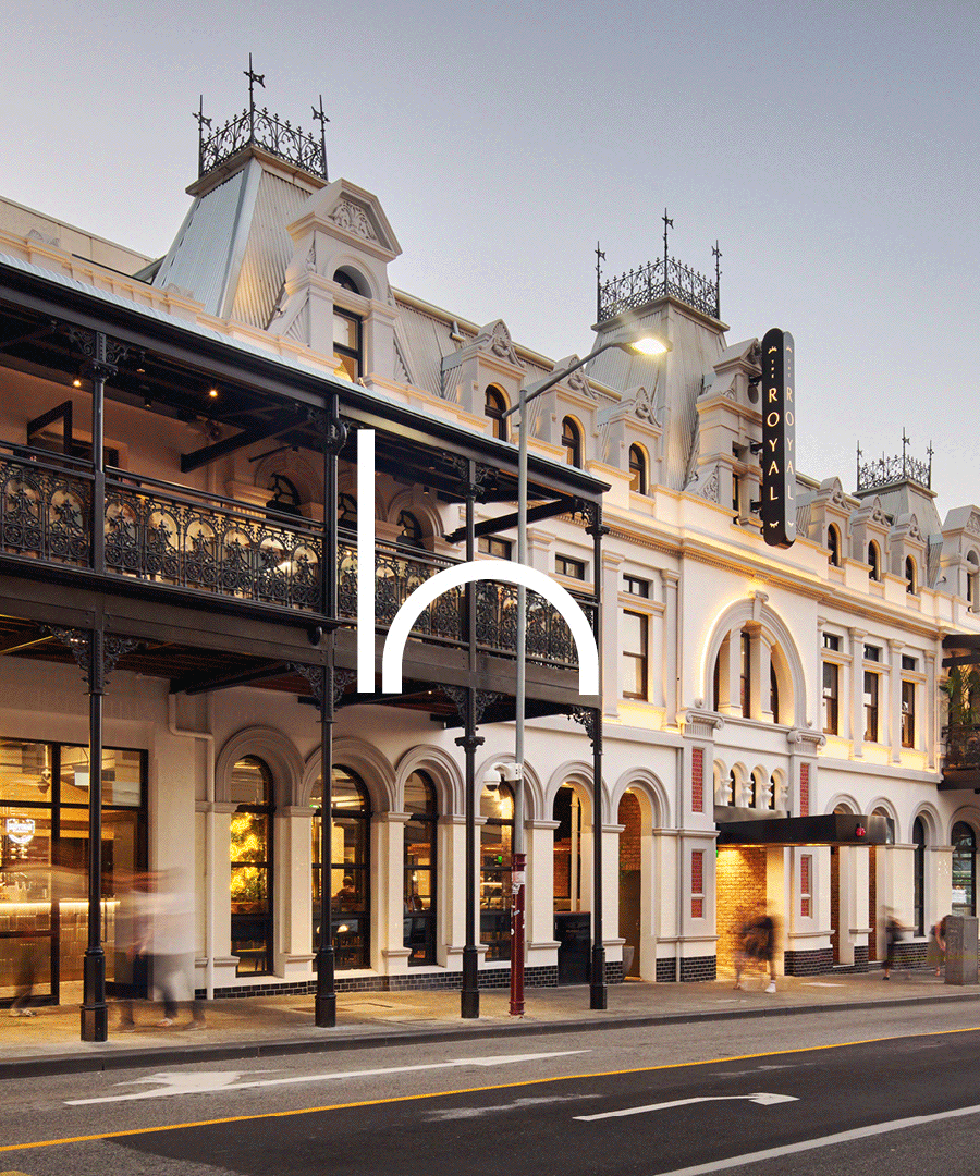
Webb & Brown-Neaves — Brand Identity & Advertising
A refreshed identity and campaign built around a simple truth, that beautiful living starts with beautifully considered design.

Brand Identity / Campaign System / Creative Direction
Black Swan State Theatre Company
A living identity system built to flex like theatre itself, shifting with mood, movement, and meaning across an entire season of stories.
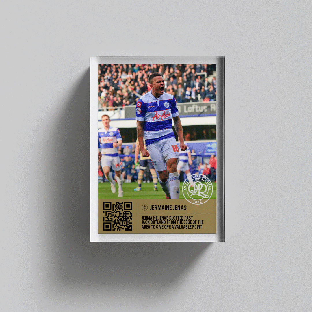
Experiential Design / Branding / NFT
Queens Park Rangers – The Big Pitch
A turf-side activation for QPR’s fan day in London, blending play, place, and branded experience to bring the club’s community to life.
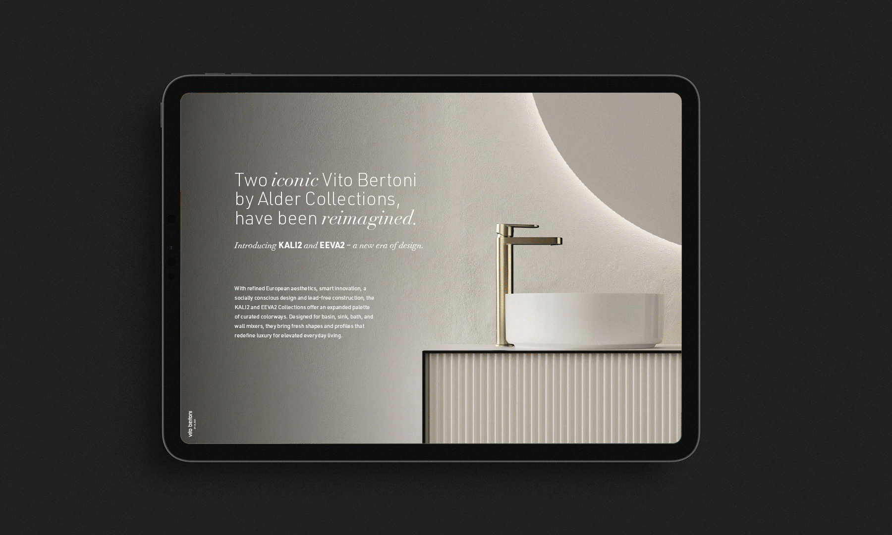
Brand Strategy / Brand Identity / Campaign
Vito Bertoni by Alder
A premium sub-brand built to balance Italian design sensibility with Alder’s innovation, expressed through refined visuals and content-led storytelling.
Branding / Visual Identity / Implementation
Hoskins – Brand Identity
A refined identity system for Hoskins, known for bringing spaces to life. Built to express trust, precision, and quiet confidence across every touchpoint.

Brand / Visual Identity / Application System
Thorion Energy – Brand Identity
A bold identity built for the future of renewables, pairing clarity and confidence with a high-performance visual language.

Campaign Concepts / Creative Direction / Advertising
Woodside x Fremantle Dockers
A bold billboard campaign pairing energy and sport — designed to amplify brand presence across stadium-scale moments.
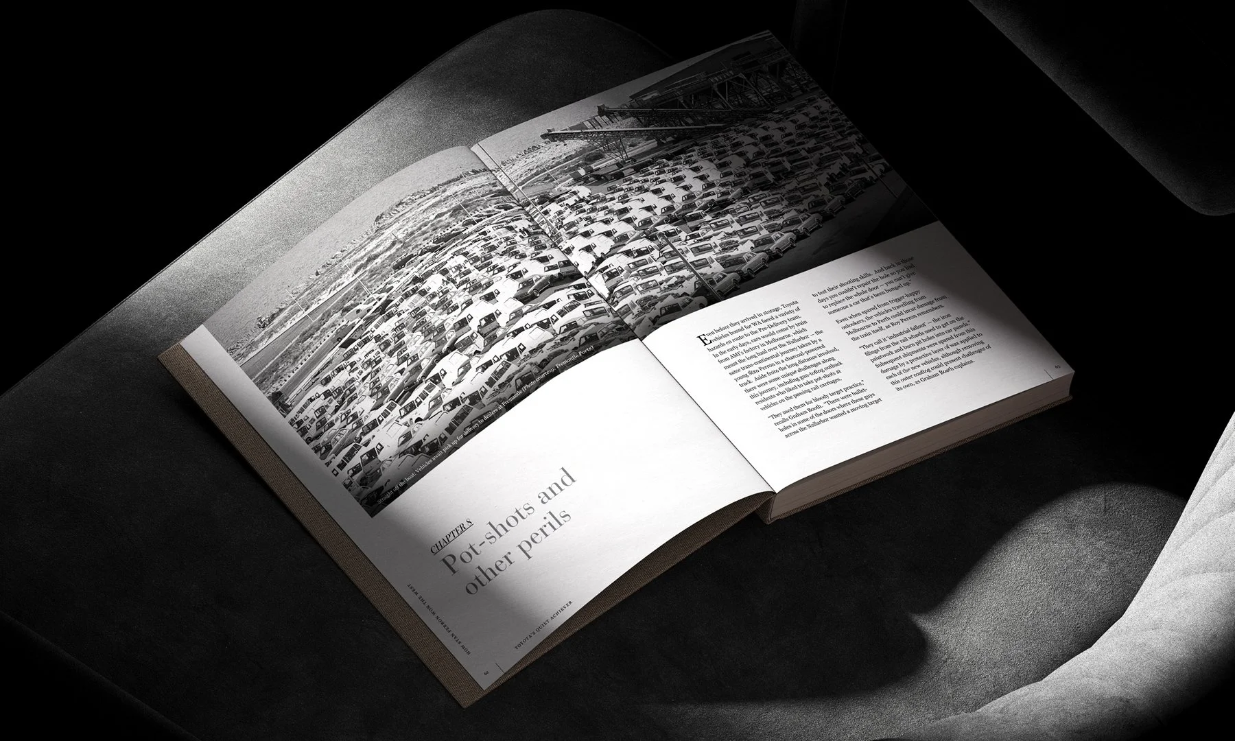
Editorial Design / Art Direction / Print Management
Toyota’s Quiet Achiever – Publication
A commemorative publication that celebrates legacy through thoughtful design, capturing Toyota’s long-standing presence in the Australian landscape with clarity and care.