Thorion Energy – Brand Identity and Application
The future of clean energy storage is here, now.
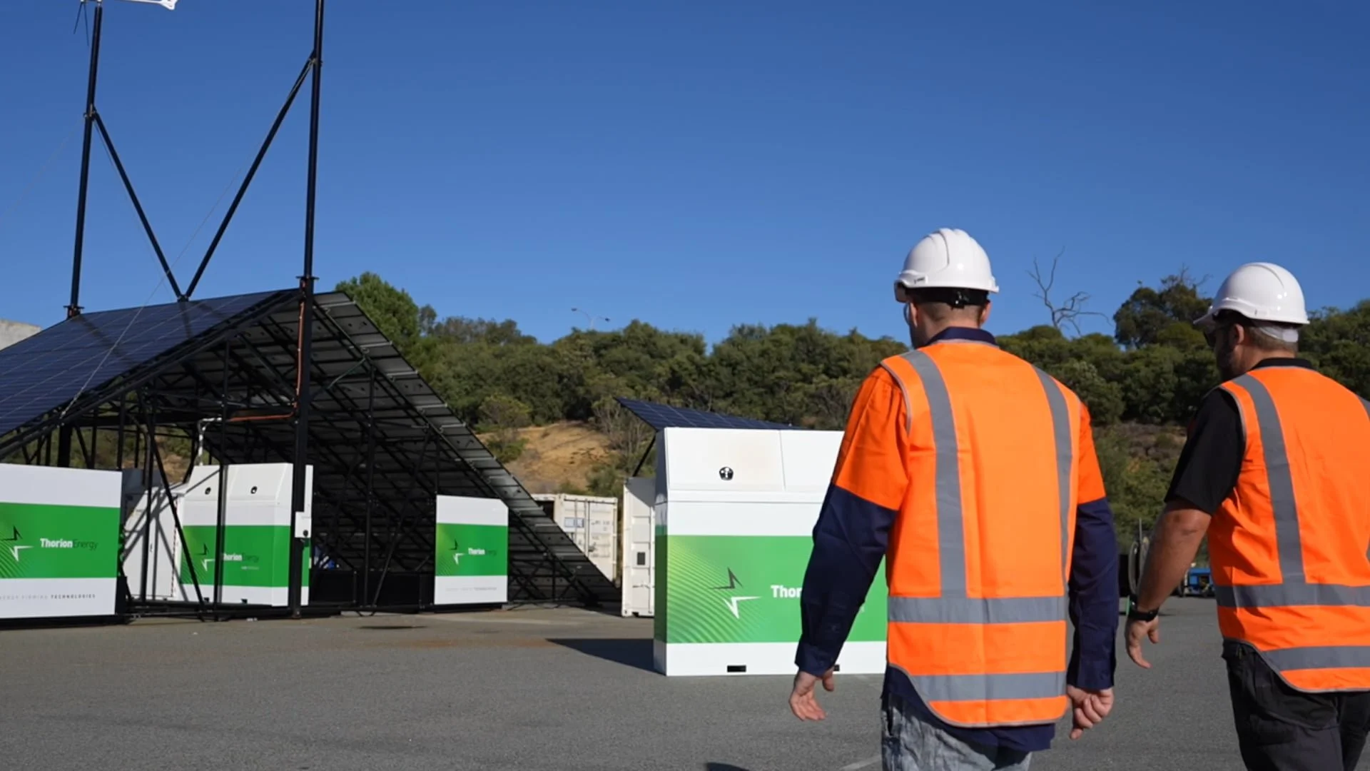
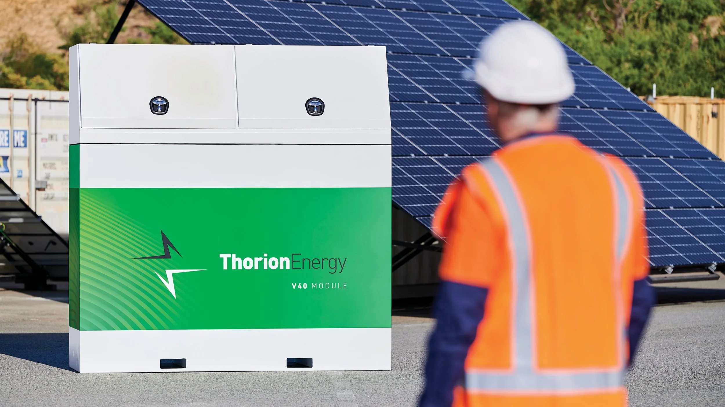
Thorion Energy is redefining energy storage through its world-leading vanadium redox flow systems, a safe, scalable, and long-duration solution for renewable infrastructure. With a global outlook and local presence, Thorion’s mission is to make clean energy accessible everywhere, to everyone.
Barbitta was engaged to develop a brand identity that could bridge advanced science with simplicity and trust. At the centre is a custom brandmark, a clean, abstract symbol that draws on the duality of positive and negative charge, a subtle nod to the liquid-based electrolyte exchange at the heart of redox flow battery technology. The form is part physics, part flow, both static and charged.
The graphic language builds from this principle. Energetic gradients, controlled repetition and sharp planes communicate stored potential, scalability, and control. The identity lives confidently on equipment modules, signage, digital interfaces and technical documentation. Robust enough for engineering environments, refined enough for boardroom presentation.
Scope
- Brand identity and monogram
- Visual language system
- Colour palette and typographic strategy
- Unit livery and product branding
Mosaic Framework™
- Form
- Purpose
- Meaning