Webb & Brown-Neaves — Brand Identity & Advertising
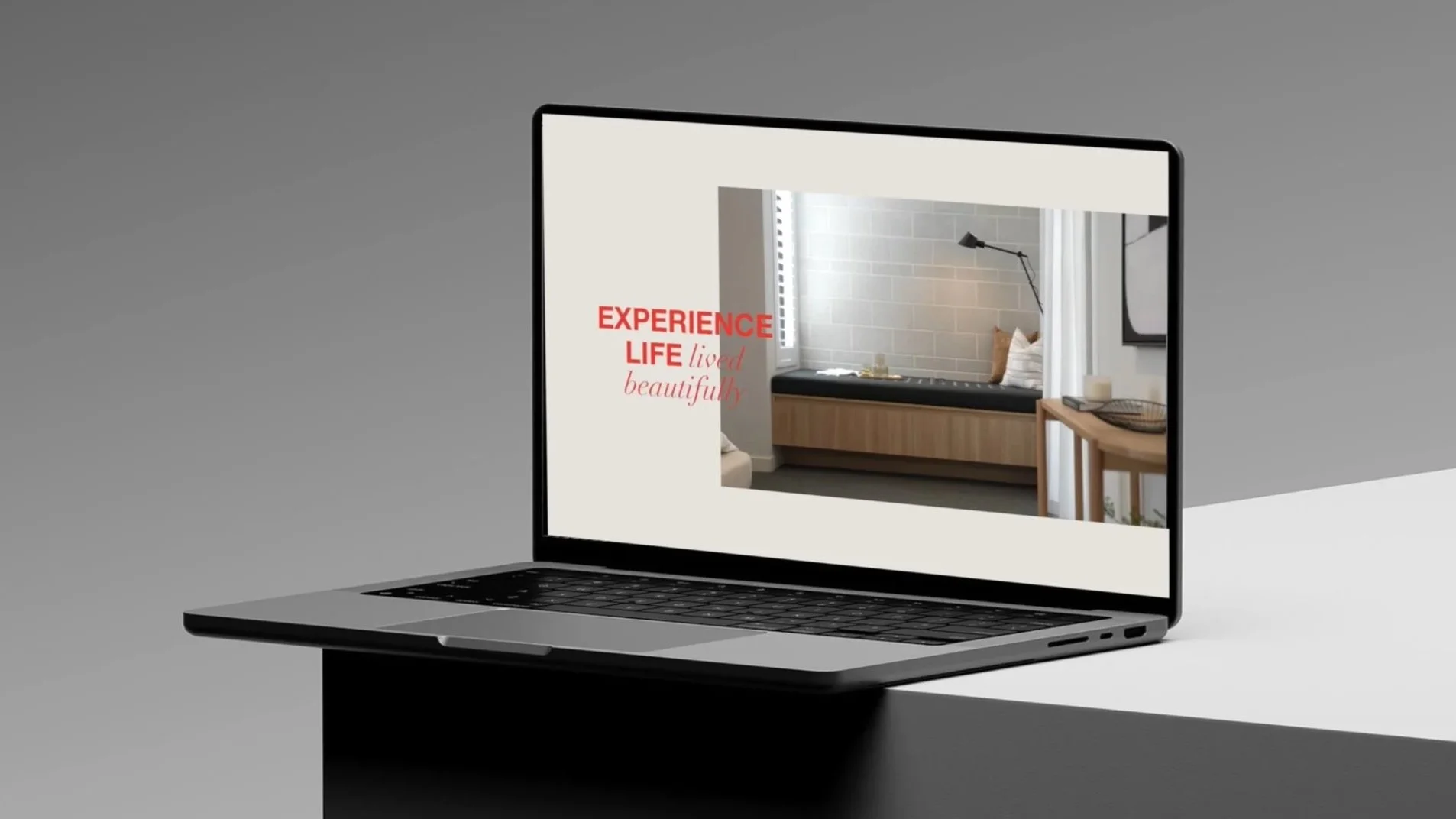
An invitation to life, lived beautifully.
In a category often defined by sameness, Webb & Brown-Neaves set out to create something more distinctive. A brand that doesn’t just sell homes, but offers a deeper promise: that design done well changes how we live.
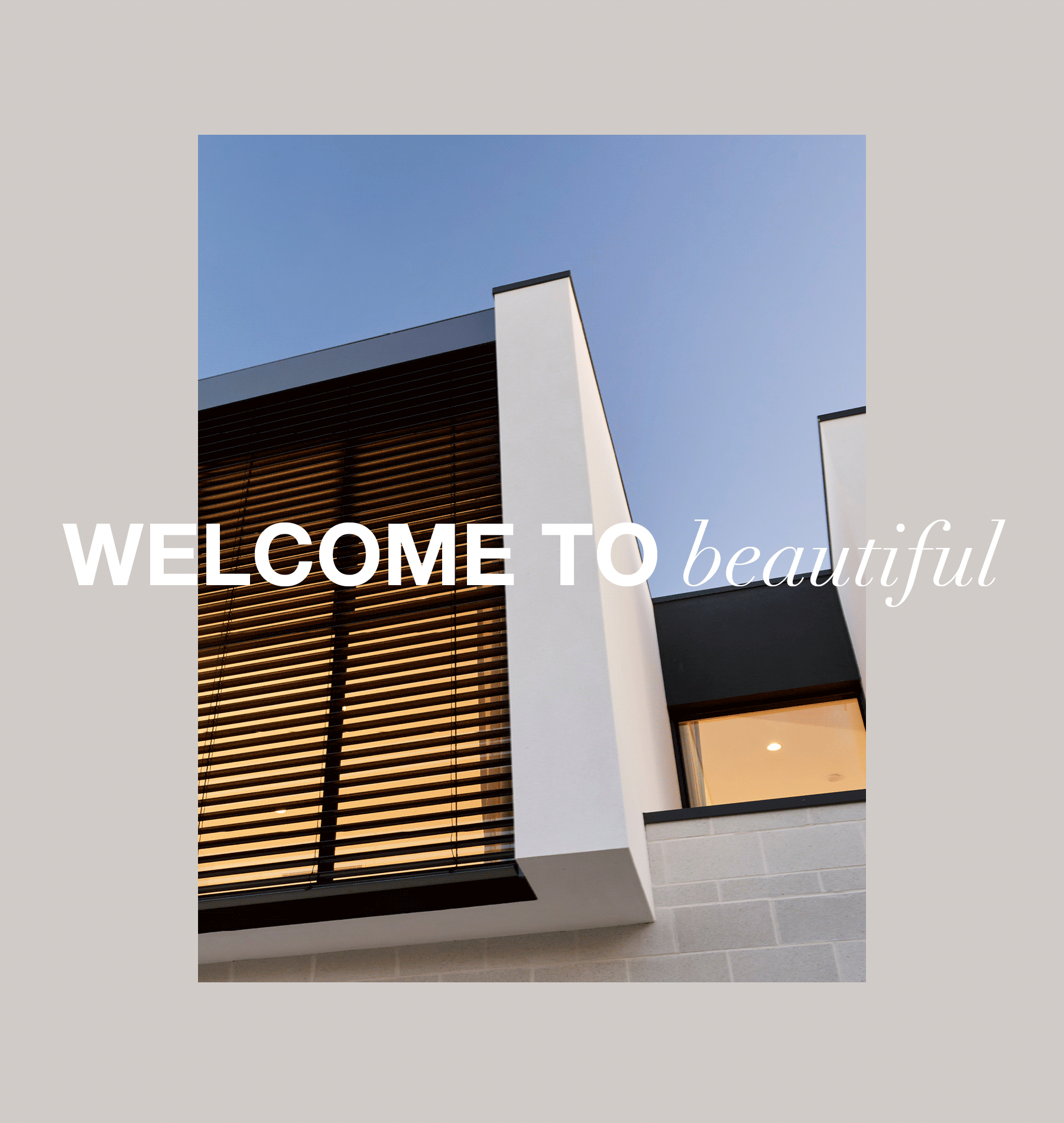
Barbitta was engaged to evolve the WB brand across strategy, identity, advertising and language. At the heart of the new system is a brand platform that captures both aspiration and emotion: Welcome to Beautiful.
More than a tagline, Welcome to Beautiful is a gesture. Warm, inclusive, and quietly confident. It invites people into the world of WB, where architecture, interior styling, and considered detail come together to create a sense of place and possibility.
To bring this to life, Barbitta developed a flexible, fluid visual system. A new colour palette, typographic approach, and image direction created space for beauty to speak softly but clearly, with a tone that’s premium, but never out of reach.
The result is a brand that holds both clarity and feeling. Structured enough to scale. Open enough to evolve.
Scope
- Brand strategy and platform development
- Visual identity evolution and campaign direction
- Colour, type, and image styling system
- Brand guidelines and rollout framework
- Advertising and content templates
Mosaic Framework™
- Meaning
- Tone
- Form
- System