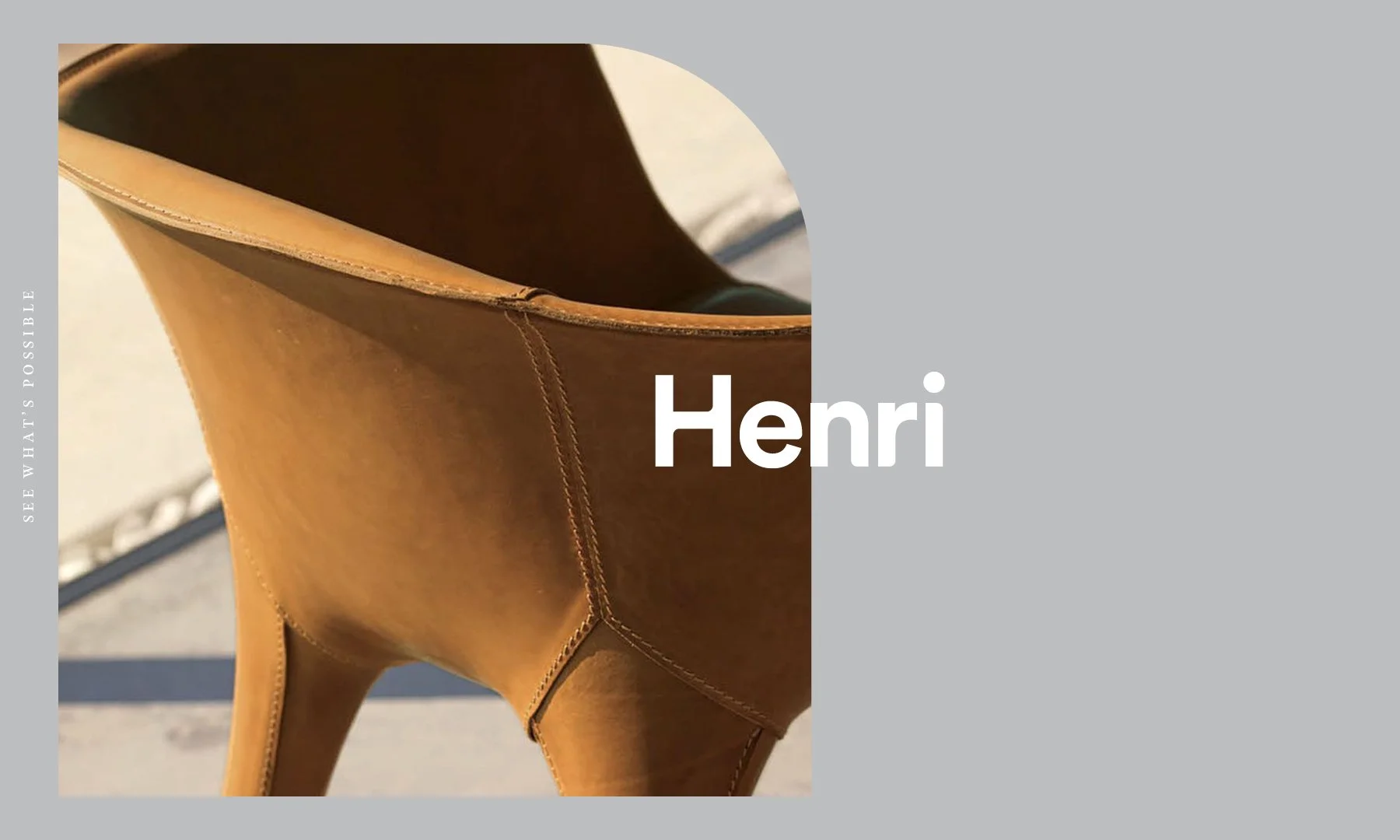
Henri Living – Brand Identity Refinement
A brand shaped by detail, led by design, and lived with ease.
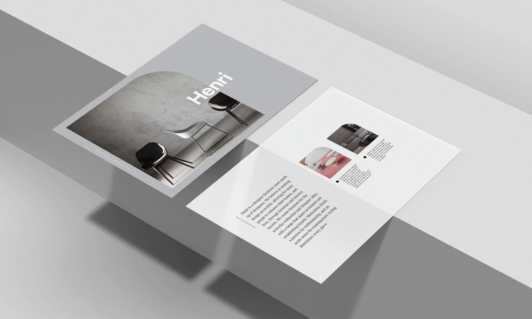
Henri Living is a design-led furniture destination, offering a carefully curated edit of premium pieces. Drawing from both established and emerging makers, the brand represents timelessness with an evolving edge.
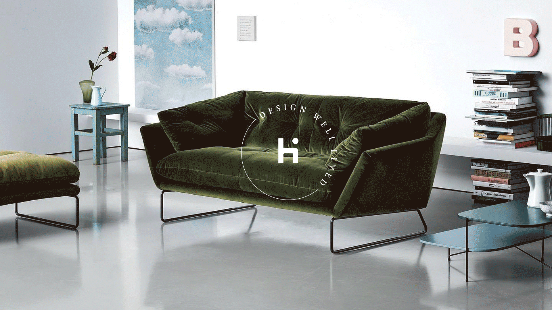
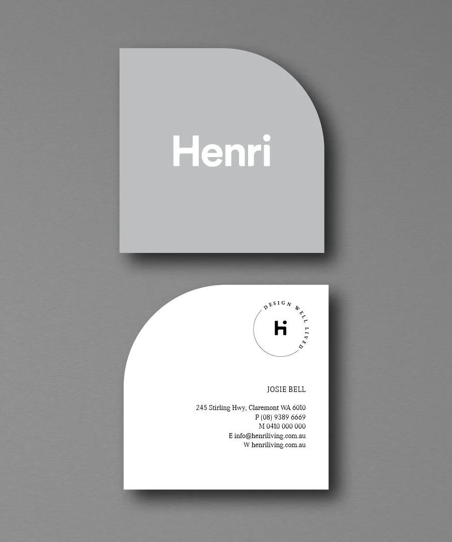
Barbitta was engaged to refine the brand identity and visual language, a project grounded in balance. The new expression needed to elevate Henri’s position as a luxury retailer, while retaining the warmth and community-focus of a family-run business. The guiding sentiment: Design well lived.
Working closely with the Henri team, Barbitta established a monochrome design system that allowed the products and photography to lead. The visual language was stripped back, restrained, and intentionally spacious, letting materials, texture, and scale speak for themselves. Type and graphic elements were kept minimal, offering just enough presence to guide without overwhelming.
The result is a brand that behaves like the products it represents: well-made, understated, and built to last. Luxury without attitude. Simplicity without sameness. A system that can stretch, flex and evolve, that always letting the furniture remain the main character.
Scope
- Brand identity refinement and visual system
- Design direction and creative strategy
- Typography, colour, and layout system
- Application across print, digital, and spatial touchpoints
- Collateral, campaign, and content templates
Mosaic Framework™
- Form
- Tone
- Meaning
- Gesture