Voi Voi
An everyday Italian, thoughtfully local and quietly familiar.
Located in the heart of Bassendean, Voi Voi draws on the spirit of the Italian neighbourhood bar. A space that welcomes all with ease in its energy and intention in its simplicity.
Barbitta was engaged to create a complete brand and spatial identity for Voi Voi, including naming, illustration, signage, and environmental moments. From the outset, the brief called for a balance. Nostalgic but not sentimental, local but not generic, characterful without cliché.
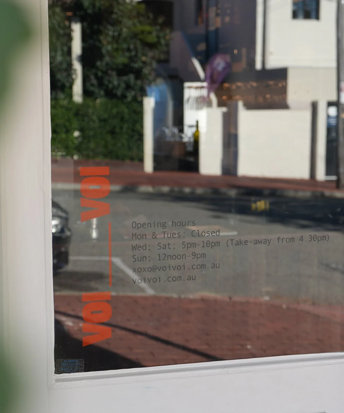
The name itself, drawn from the informal Italian for “you, you,” became the heart of the brand. It carries with it a sense of familiarity and emphasis, a subtle gesture that reflects the space’s personal, people-first philosophy.
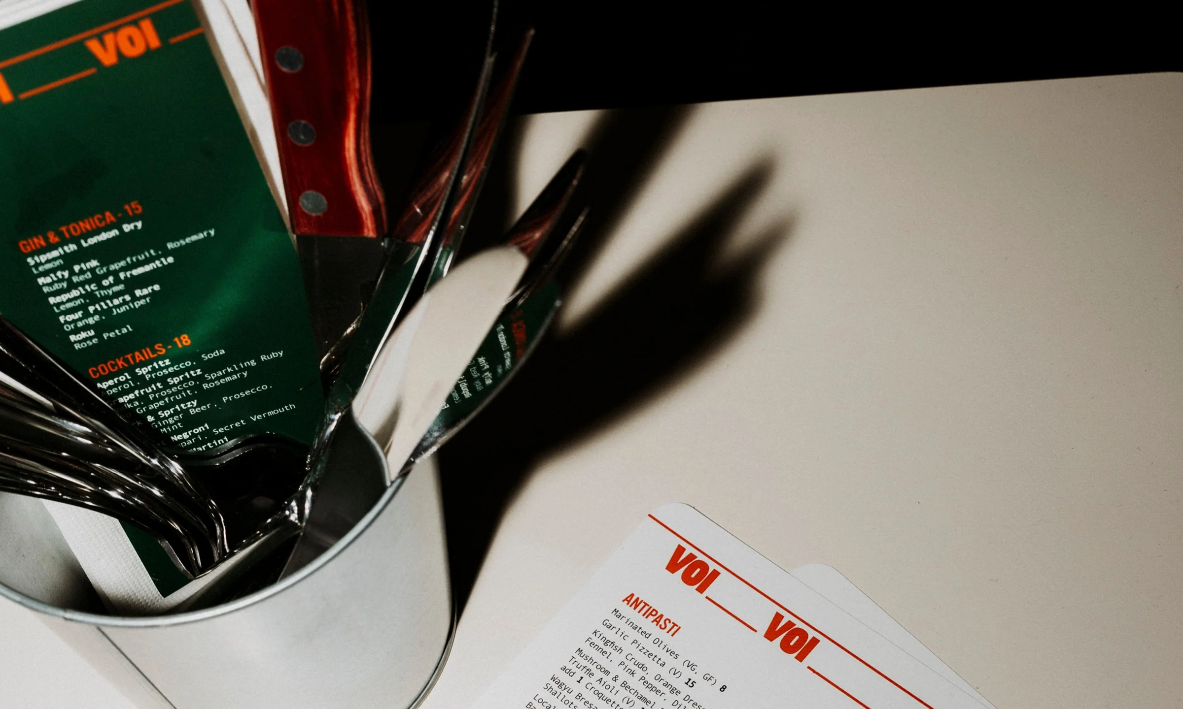
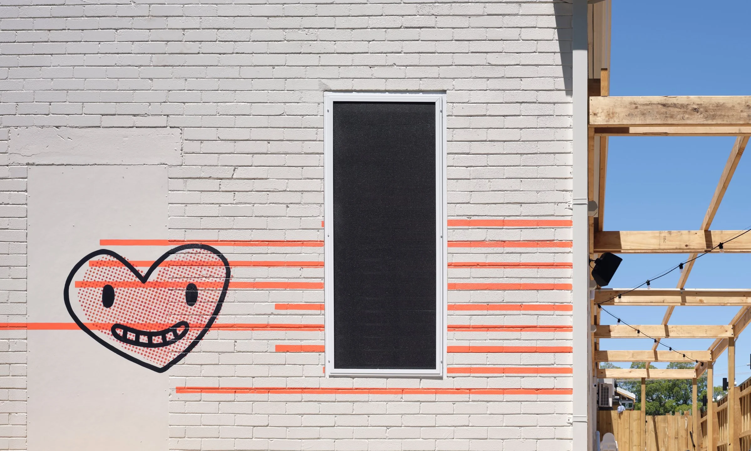
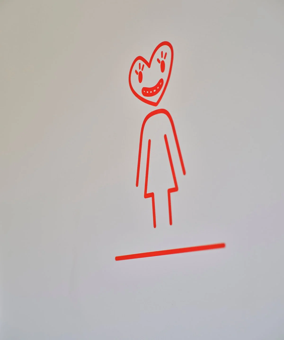
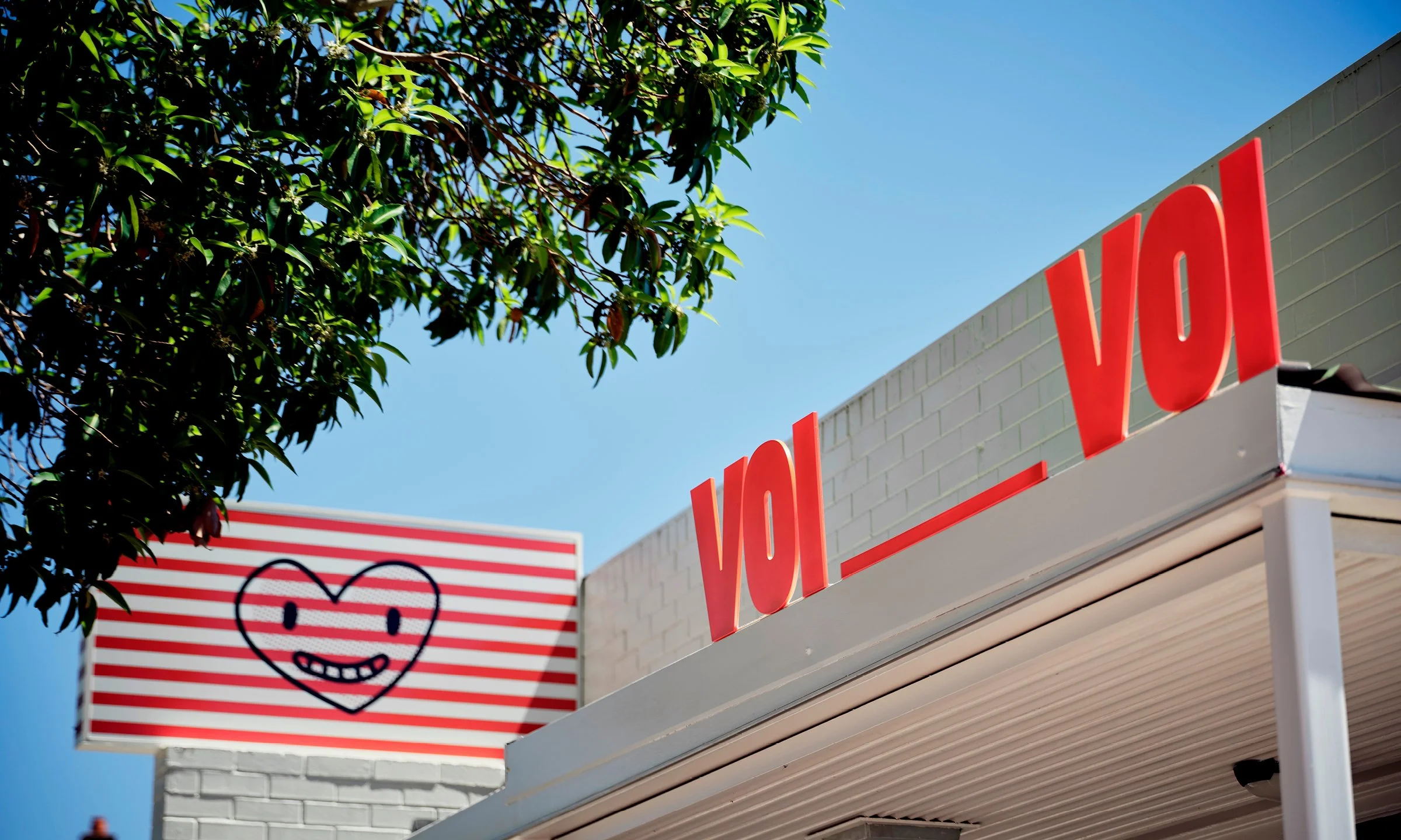
Guided by the Meaning, Story, and Atmosphere tiles of the Barbitta Mosaic™, the design response favoured restraint over embellishment. A crisp palette of red and white became the foundation for identity and signage, supported by a series of quiet graphic gestures — including a hand-drawn heart, used sparingly to soften space and sentiment.
Externally, signage and mural work signal warmth and welcome without overpowering the streetscape. Internally, remixed Italian posters hang on wall, graphic illustrations support tone and texture, allowing the food and conversation to lead. Every element was calibrated to feel embedded, not applied.
Scope
- Brand naming and identity system
- Illustration assets and graphic language
- External and internal signage
- Environmental graphics and mural art
- Spatial tone and design alignment
Mosaic Framework™
- Meaning
- Story
- Atmosphere